It's Bisexual Visibility Day and this site wouldn't be Bifurious if it was a fluffy post, so I am going to complain about an aspect of the bisexual pride flag that will be making many appearances today.
I suspect that everyone reading this knows what it looks like, but just in case, it's this:
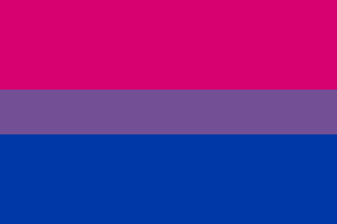
.. three bands of colour: pink, what's officially a dark shade of lavender but which almost everyone calls purple, and blue.
How do you make sure that you get the right colours?
Well, because colour is almost as interesting as human sexuality, there are almost as many ways of describing colour as there are of describing sexuality.
One widespread commercial standard is by Pantone and mixes up to fourteen colours of ink to get the exact result that its 'Pantone Colour Matching System' specifies. And it's this that the colours are specified in: top stripe 226, middle 258, bottom 286. You can take those numbers to hundreds of thousands of commercial printers around the world and get the same colours on paper – shiny coated or dull matt! – as the original designer, Michael Page, chose back in 1998.
But you're almost certainly looking at this on a screen, so the image file above specifies a mix of three colours of light: red, green and blue, here each between 0 (none) and 255 (as bright as the screen can manage). The results cover most of the colours the majority of human eyes can see. But even if we are running the same operating system – because they can show colours differently – your screen differs physically from my screen, so it won't be quite the same.
If I had a colour printer, because I can't afford the 'how much?!?' cost of one that works with true Pantone colours and colour mixing with ink works differently from the way it does with light, it would very probably mix four inks: cyan, magenta, yellow and black to get a reasonable approximation.
But I have a monochrome laser printer.
Here, yet another way of talking about colour can become more useful: hue (for example 'red'), saturation (how 'red' it is), and.. well, it depends on which model of colour you're using whether you talk about 'luminance' / 'lightness', 'value', or 'intensity' to say how bright the result is.
Originally developed to add colour to TV pictures while maintaining compatibility with black and white TV sets, it also reflects the vision of many people who cannot see colours: they perceive different hues with the same saturation as being the same. In the case of the bisexual pride flag, the saturation of the pink (98%) and the blue (100%) are very similar, so they see this:

.. with the pink and blue areas looking almost exactly the same.
Which is not really a good representation of the flag.
It's similar when the flag is printed in black and white. Here, printers either look at the saturation or the lightness. In the former case, if a colour is highly saturated, it gets printed as a darker black whether it's a very red 'red' or a very green 'green' and the result is as above. In the latter, again the lightness of what are supposed to be different colours are very close and this is the best result:

(If you print it on any reasonably affordable printer, you'll find the bands look even more similar!)
Had different saturations / lightnesses of the colours been chosen, it would have been more like the current version of the rainbow flag where it is a lot clearer that there are six colours, even when printed in black and white:

Ah well, it's too late now.